If you've ever seen these on the Humanagement app and wondered about what they can do or represent, this article will help you understand the how and when to use these buttons for your stats reporting.
Let's dive right in:
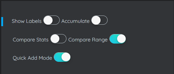
Show Labels:
When toggled on, this will make labels/values visible to on the graph. This helps for easy readability and assimilation of data.
Accumulate:
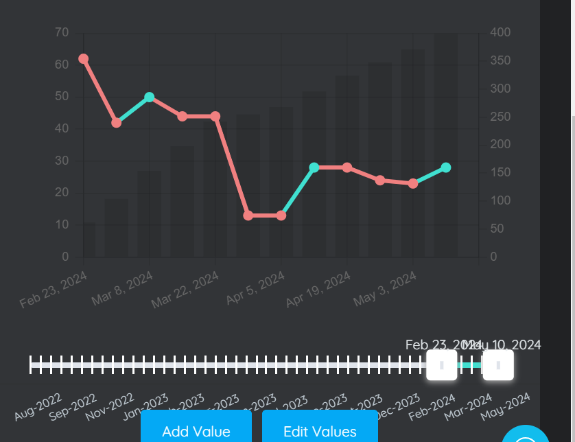
When toggled on, you'll be able to accumulate stat data over certain periods as needed by you. the sliders which can go either ways help to choose the range you'd like to accumulate.
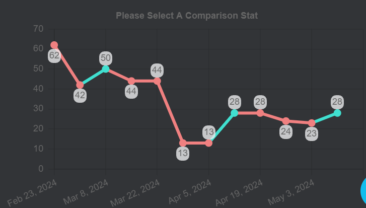
Compare Stats:
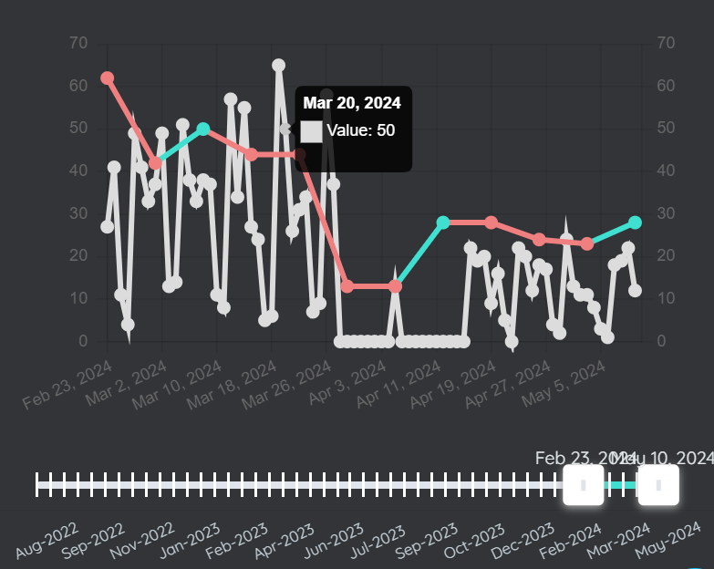
When compare stats is toggled on it allow you compare two or more stats over a period of time using the slider. To compare stat, click on the primary stat you'd like compare then toggle on the compare stat button. Click on the secondary stat you'd like to compare then use the sliders to choose the preferred dates.
Compare range:
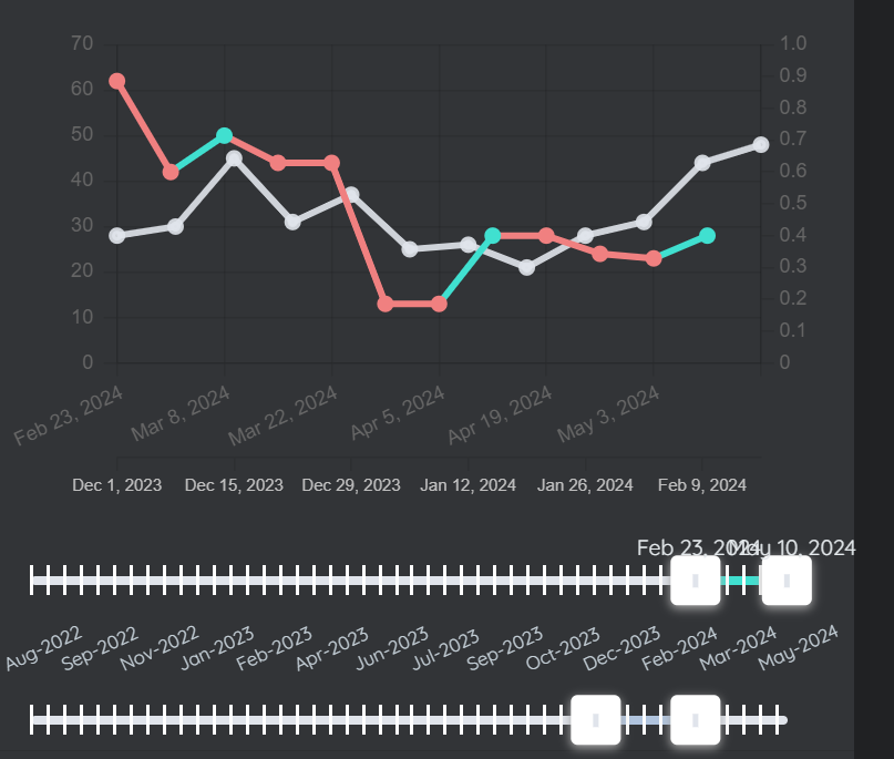
Just like compare stats, when compare range is toggled on. it allows you compare at least more than one stat ranges.
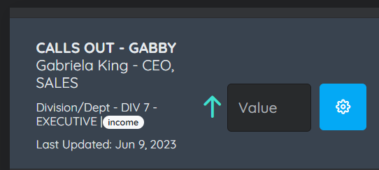
Quick Add Mode:
Quick add mode give the most quickest method to add stat value. When toggled on, it reveals a small box by every stat expect calculating stat to quickly add stat values. Once stat value is entered, press enter to save value.